Thesis ProjectICHIRAIDO 一来道
Ichiraidō is a conceptual branding project that explores the application of traditional Japanese design philosophies within a contemporary identity system.
Through the creation of a fictional matcha brand, the project investigates how principles such as Kanso (簡素), Fukinsei (不均整), Shibui (渋味), and Wabi-sabi (侘寂) can be translated into modern visual language.
Rather than treating these philosophies as historical references, the project positions them as flexible design tools. The result is a brand system that balances restraint and innovation, honoring Japanese aesthetics while demonstrating their relevance in contemporary branding.
The Art of Japanese Design: A Visual Exploration
Design Principles Explored
Kanso (簡素) — Simplicity and reduction
Fukinsei (不均整) — Asymmetrical balance
Shibui (渋味) — Subtle refinement
Shizen (自然) — Naturalness
Datsuzoku (脱俗) — Freedom from convention
Seijaku (静寂) — Tranquility
Yūgen (幽玄) — Quiet elegance
Wabi-sabi (侘寂) — Beauty in imperfection
Identity
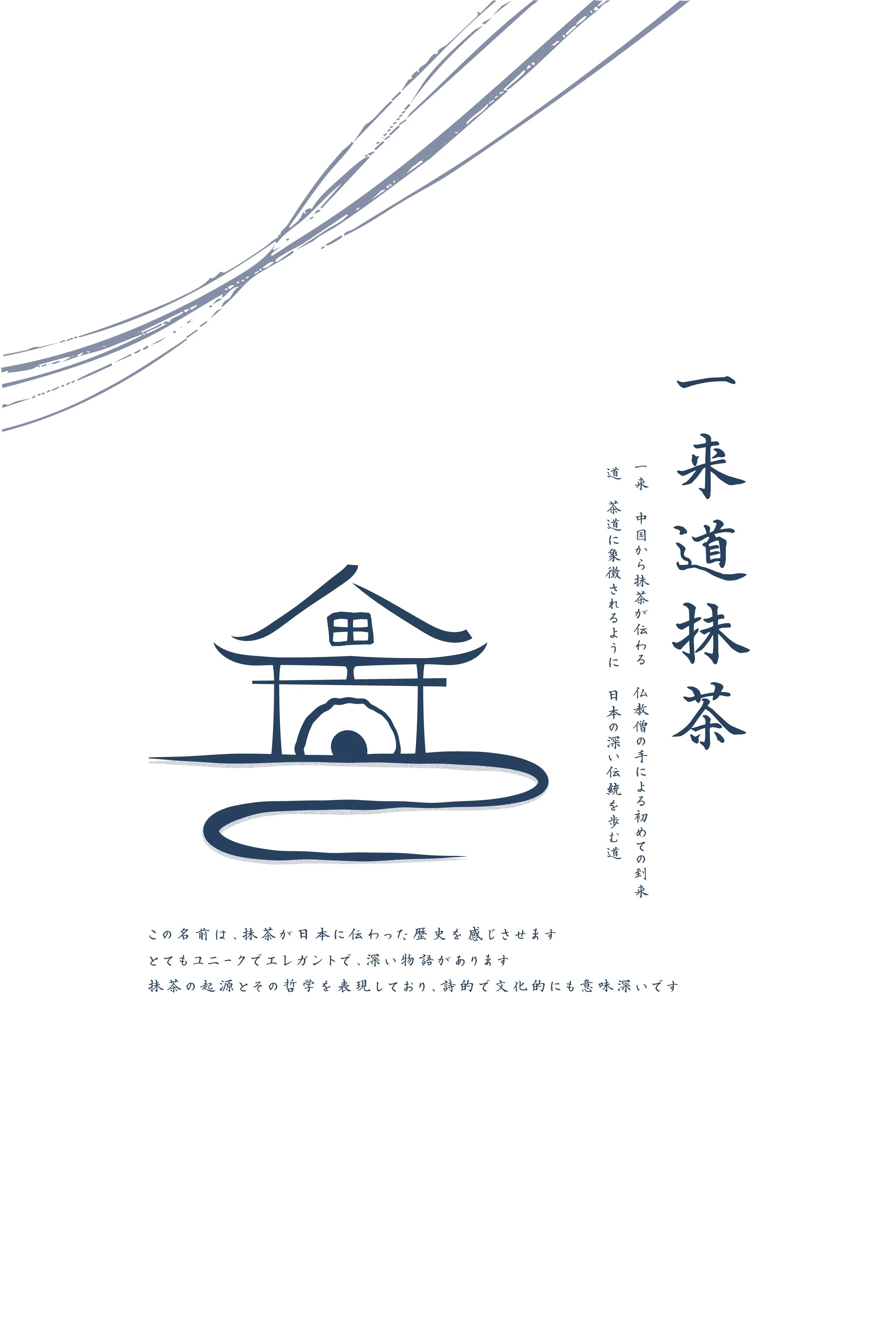
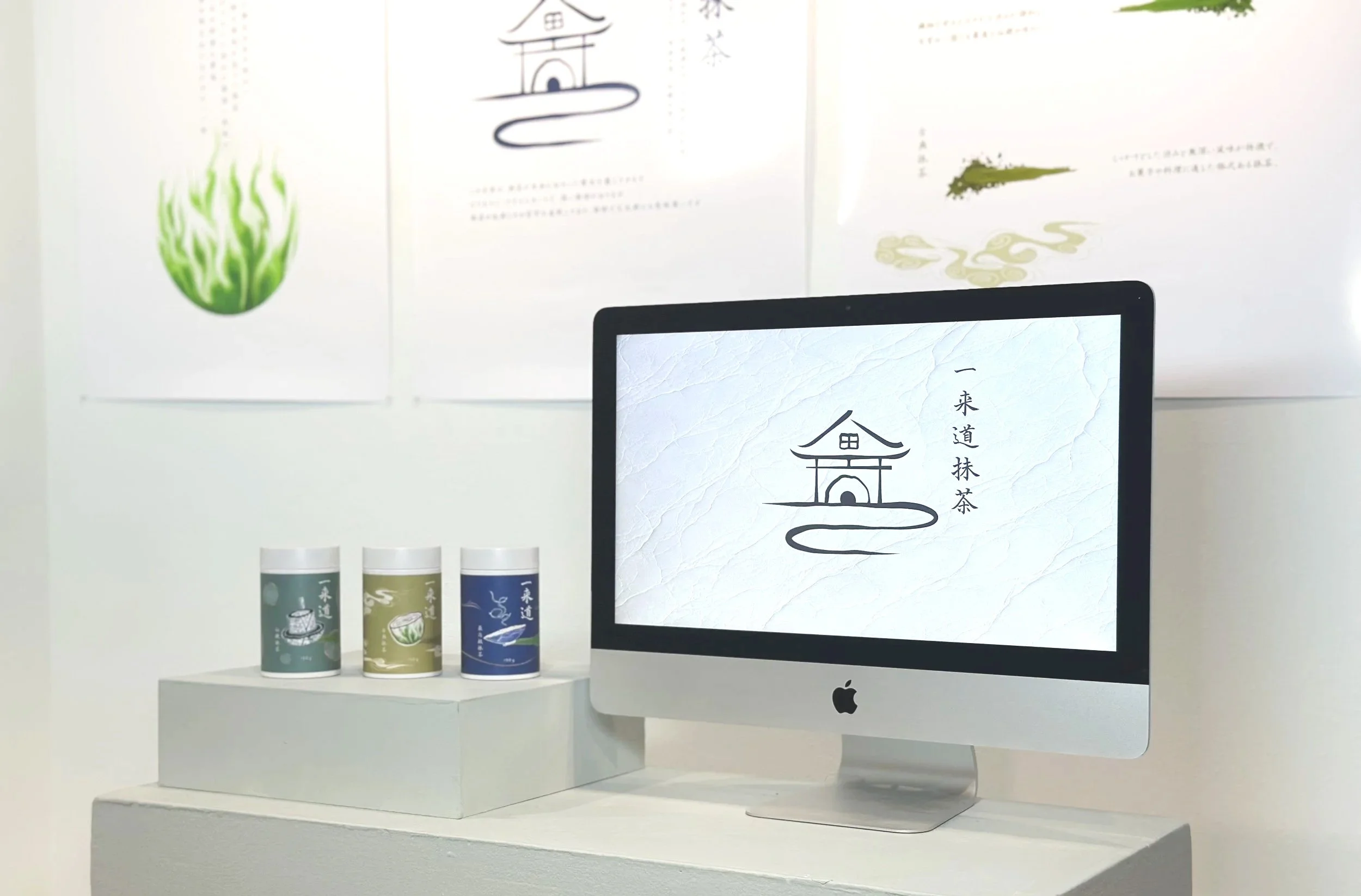
Ichiraidō, is a brand created to showcase the beauty of Japanese design principles through matcha. The name combines 一来 (Ichirai, “first arrival”), symbolizing how a Buddhist monk first brought matcha to Japan, and 道 (Dō, “the way”), representing traditions like 茶道 (Sadō, “The Way of Tea”). Through visual identity and motion design, this project highlights the elegance and philosophy behind Japanese aesthetics. Ichiraidō captures the essence of matcha’s journey while celebrating the harmony and simplicity of Japanese design.
The logo reflects the core theme of my thesis, the first arrival of matcha in Japan. Inspired by the character 茶道 (Sadō, “The Way of Tea”), it blends abstract shapes of a gate or home to symbolize entry, a central circle representing both the sunset (a symbol of arrival in Japanese culture) and the stonemill used to grind matcha, and a curved path below to suggest a journey or way. Together, these elements express tradition, movement, and the cultural significance of matcha’s introduction.
The palette consists of green that symbolizes the matcha itself and renewal, dusty yellow evokes warmth, earth, and tradition, while blue brings a sense of calm, depth, and the flow of time.
Typeface: AH白洲写経体 (AH Hakushu Sutra)
Its deep connection to tradition and spirituality. Inspired by Japanese sutra calligraphy, the typeface carries a quiet elegance that aligns perfectly with the values of Ichiraidō—mindfulness, heritage, and the sacredness of each moment.


packaging
Designed for three distinct matcha grades, the forms and layouts maintain structural consistency while allowing subtle variation through color and composition. Minimal typography, controlled asymmetry, and restrained detailing reinforce the brand’s quiet elegance.
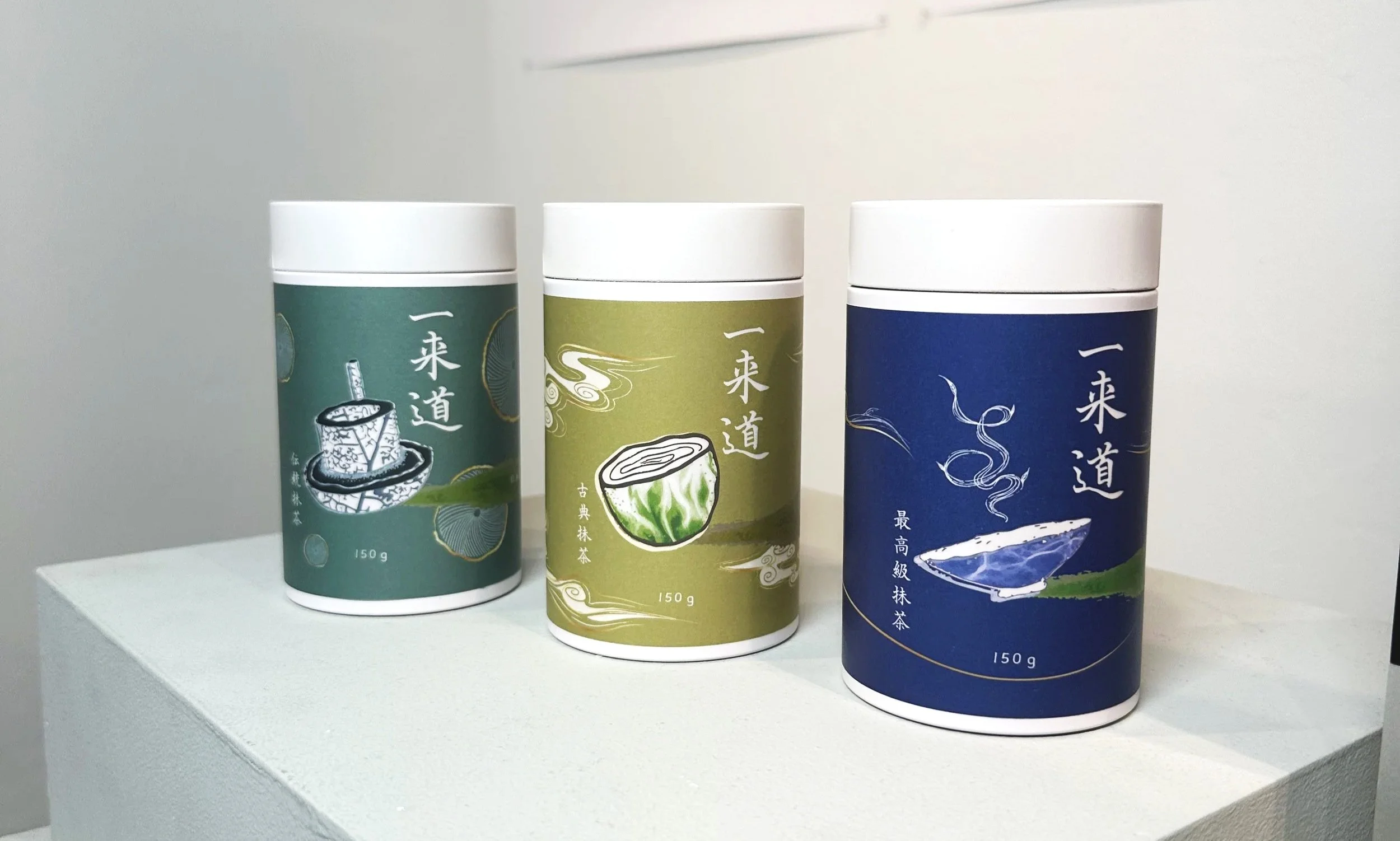
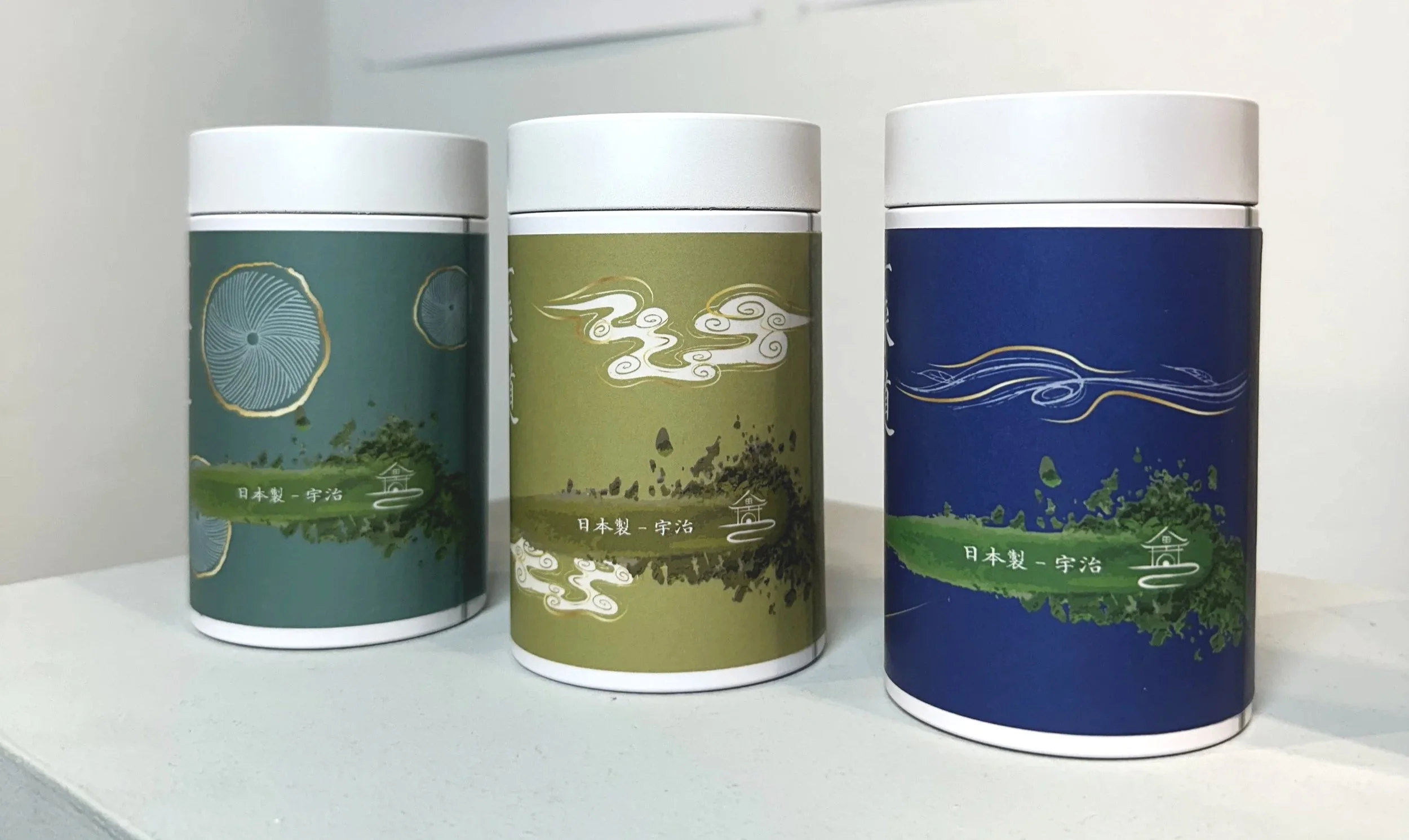
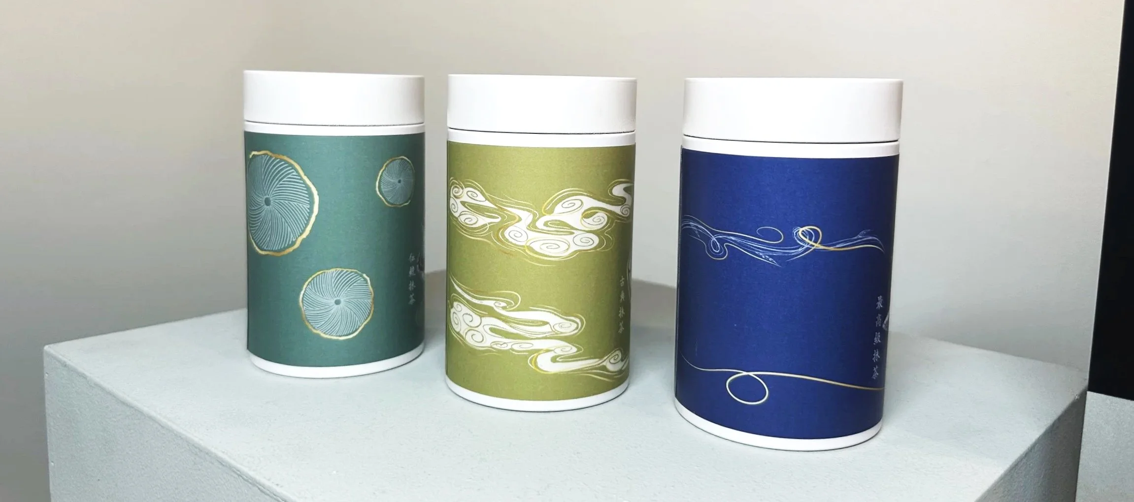
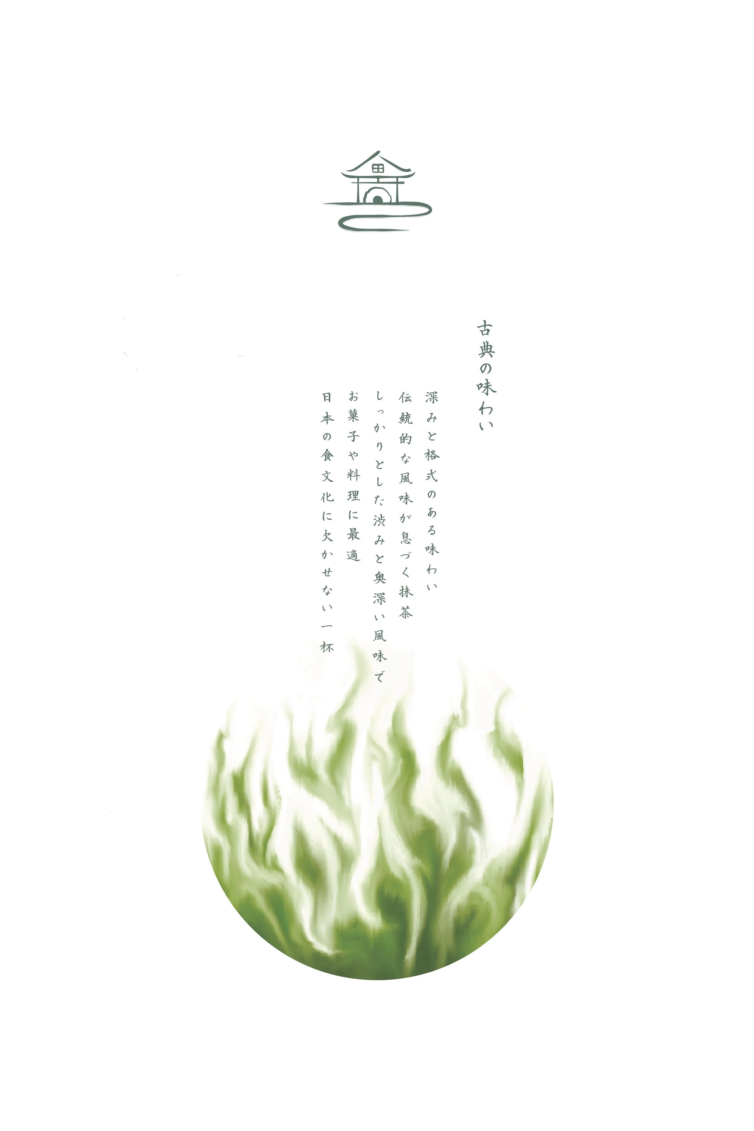
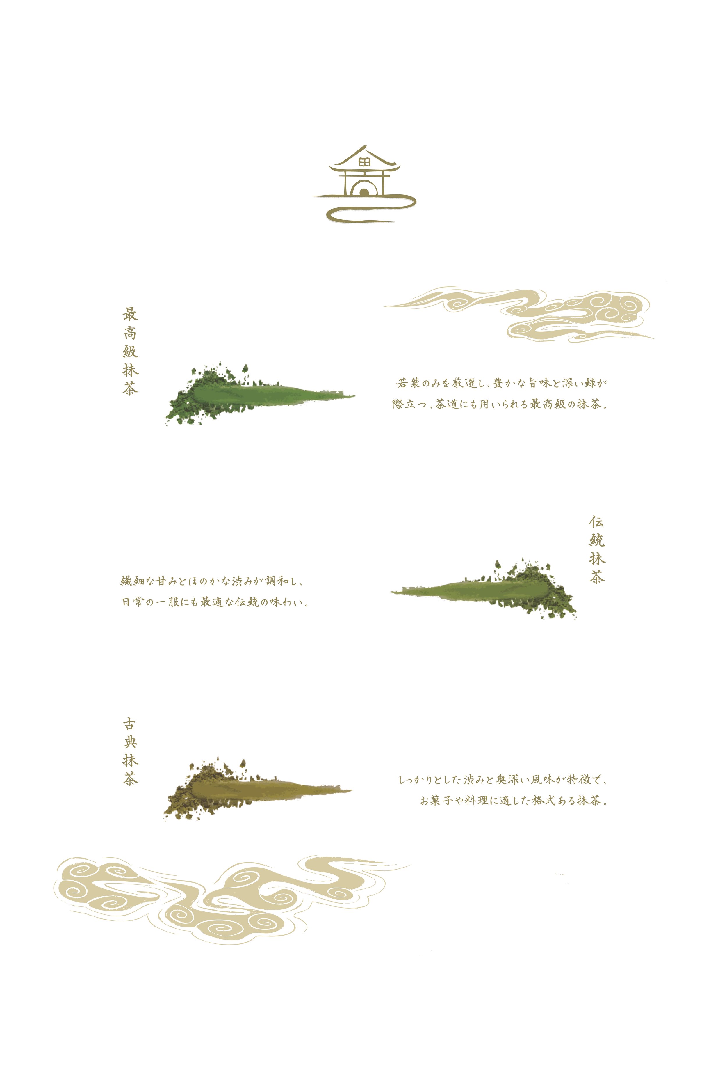
The packaging system is structured around three distinct grades of matcha: 最高級抹茶 (Saikōkyū Matcha), 伝統抹茶 (Dentō Matcha), and 古典抹茶 (Koten Matcha). Each tier reflects a different expression of refinement while maintaining a unified visual language. Through subtle variations in composition, color, and typographic balance, the system preserves brand consistency while communicating hierarchy and character. The result is a cohesive packaging family that honors tradition while embracing contemporary restraint.

最高級抹茶 (Ceremonial Grade)
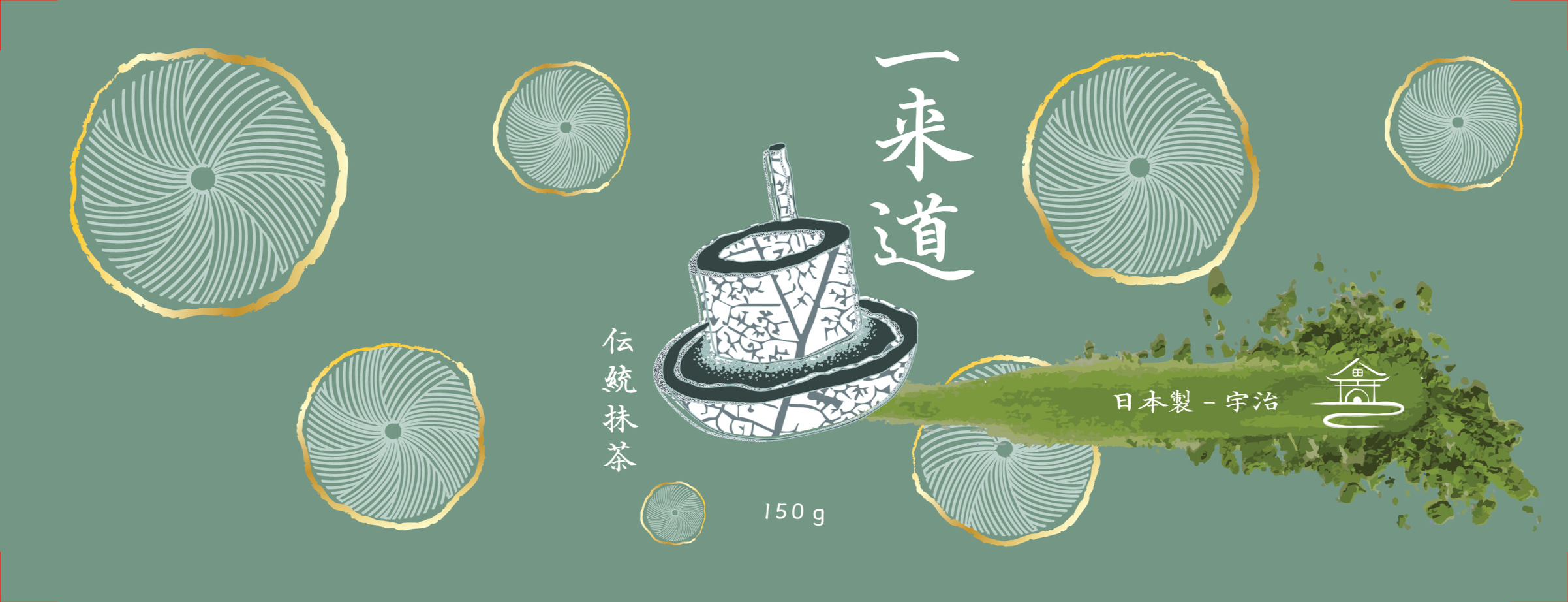
伝統抹茶 (Traditional Grade)
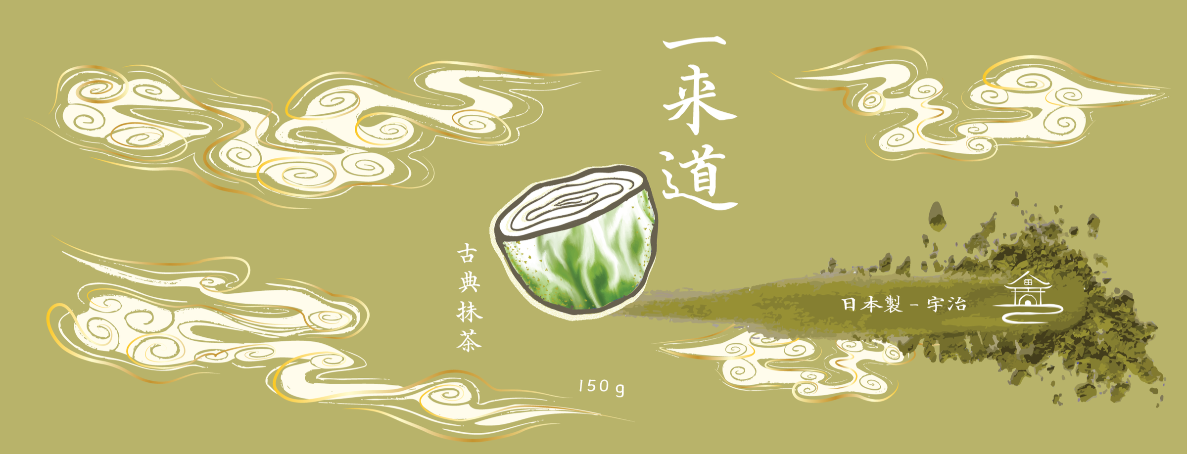
古典抹茶 (Classic Grade)
posters
The poster series extends the Ichiraidō identity beyond packaging into expressive visual compositions. Each poster explores Japanese design principles through typography, spatial balance, and restrained form. By emphasizing asymmetry, minimalism, and quiet visual rhythm, the series interprets traditional aesthetics within a contemporary graphic context.