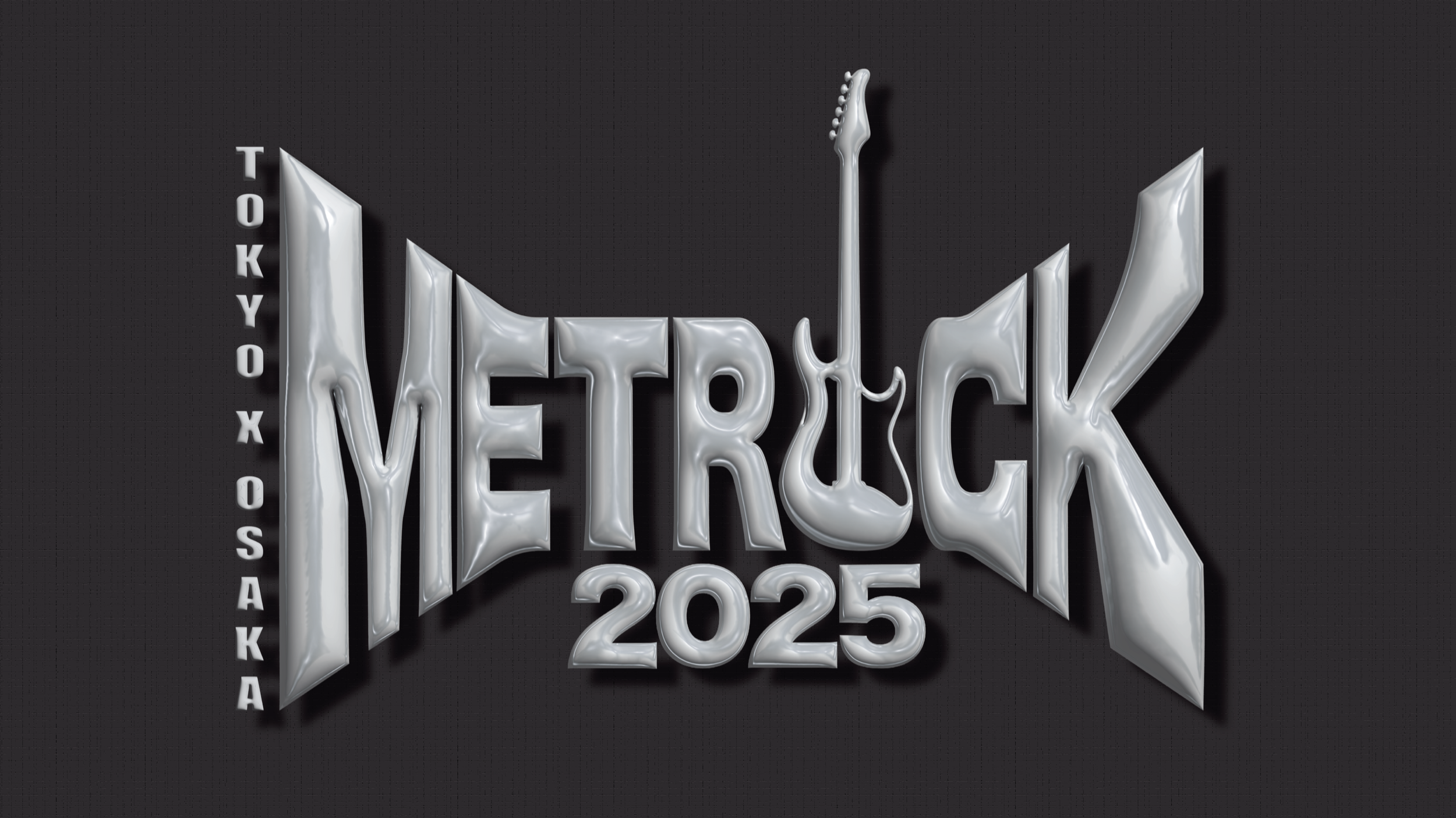
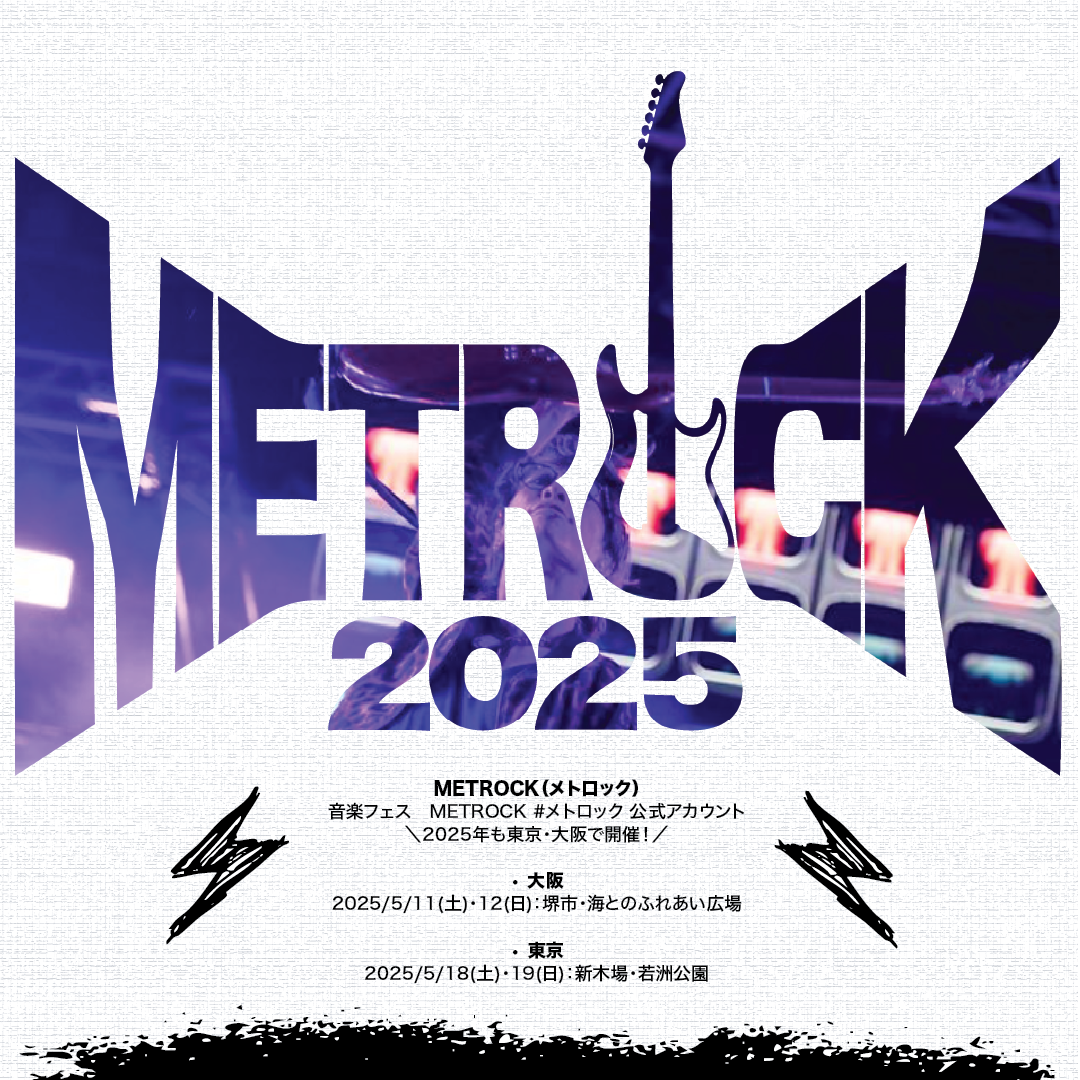
Brand IdentityMETROPOLIAN ROCK FESTIVAL Rebrand
HISTORY
Metrock is a popular music festival held annually in Japan, specifically Osaka and Tokyo, primarily features Japanese rock, pop and indie artists. The festival held outdoors late spring - early summer in a lively energetic atmosphere. The first festival was held in 2013. Showcases local and alternative artists, great platform for both established and up-and-coming musicians. Offers multiple stages for different genres, usually in open-air spaces such as parks.
Identity
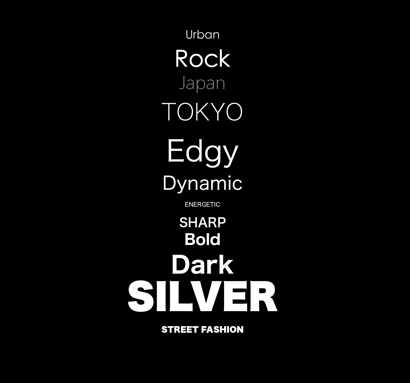
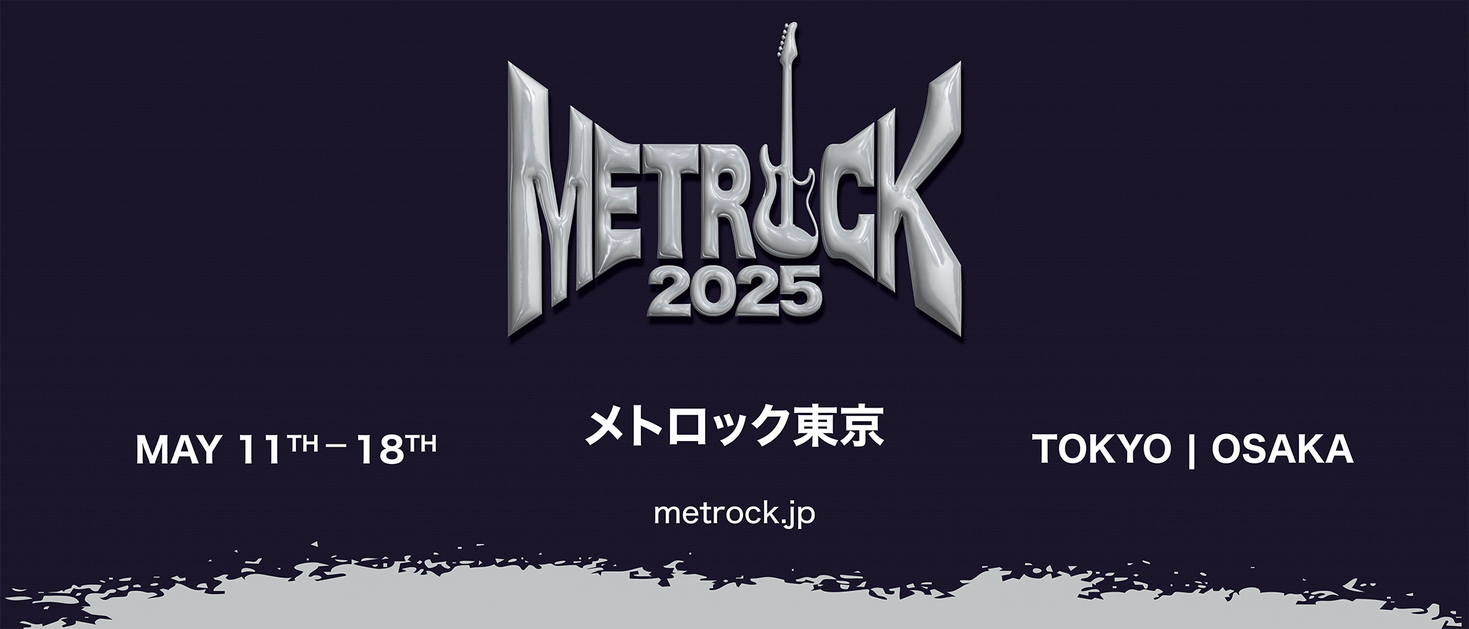
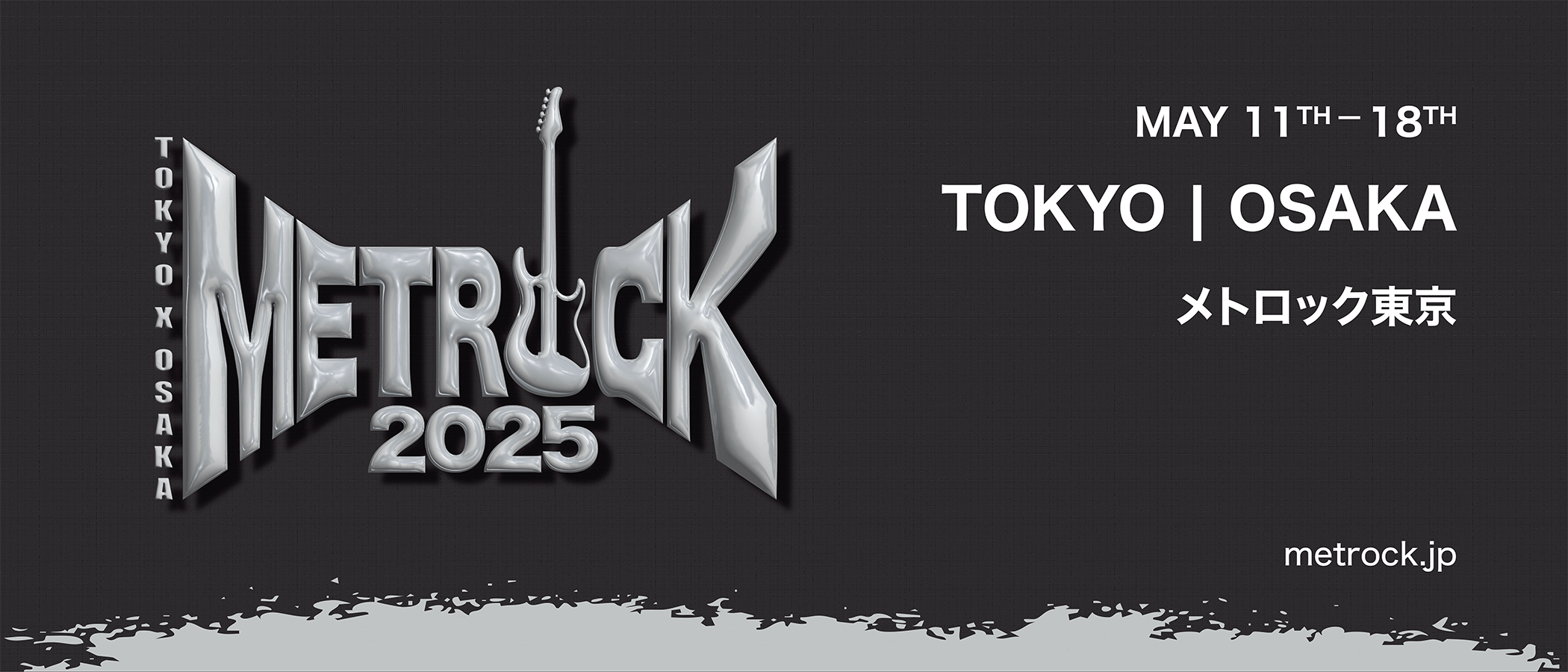
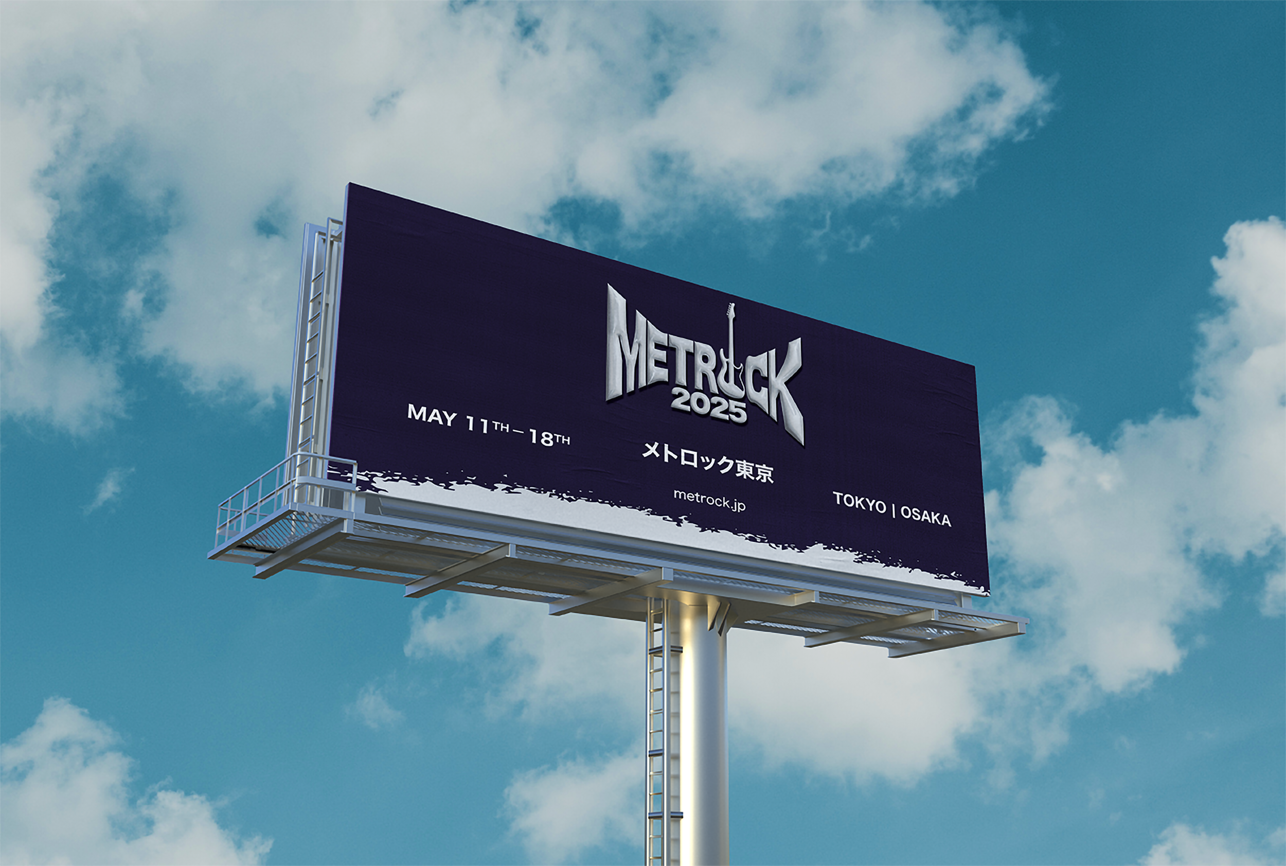
Rebranding Metrock Festival to have a strong core identity for and timeless design. The design should be modular and flexible to still be able to change the visual concept annually without having to design the logo annually from a scratch. Emphasizes the dynamic and energetic “feel” of the rock music genre.
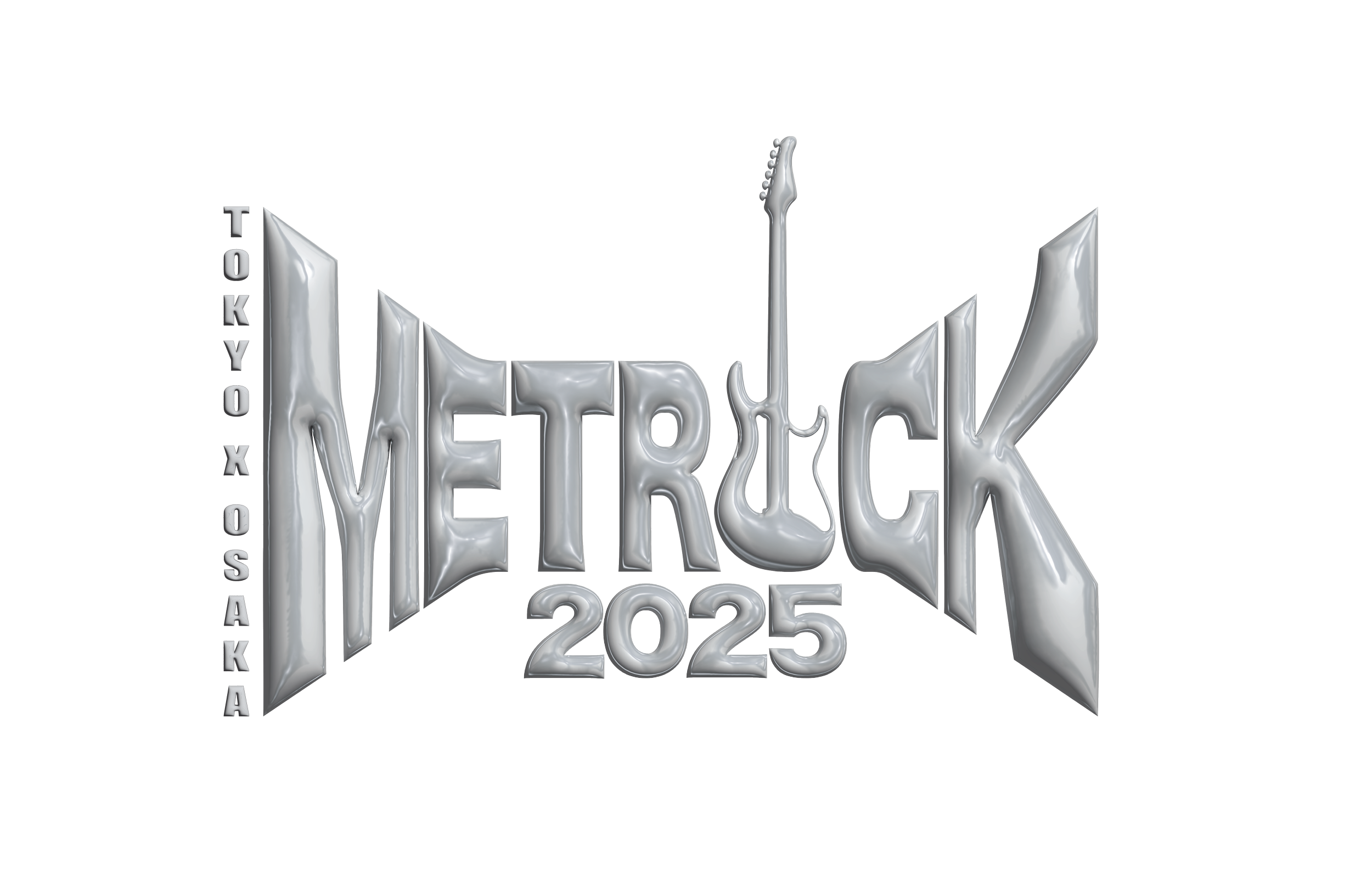
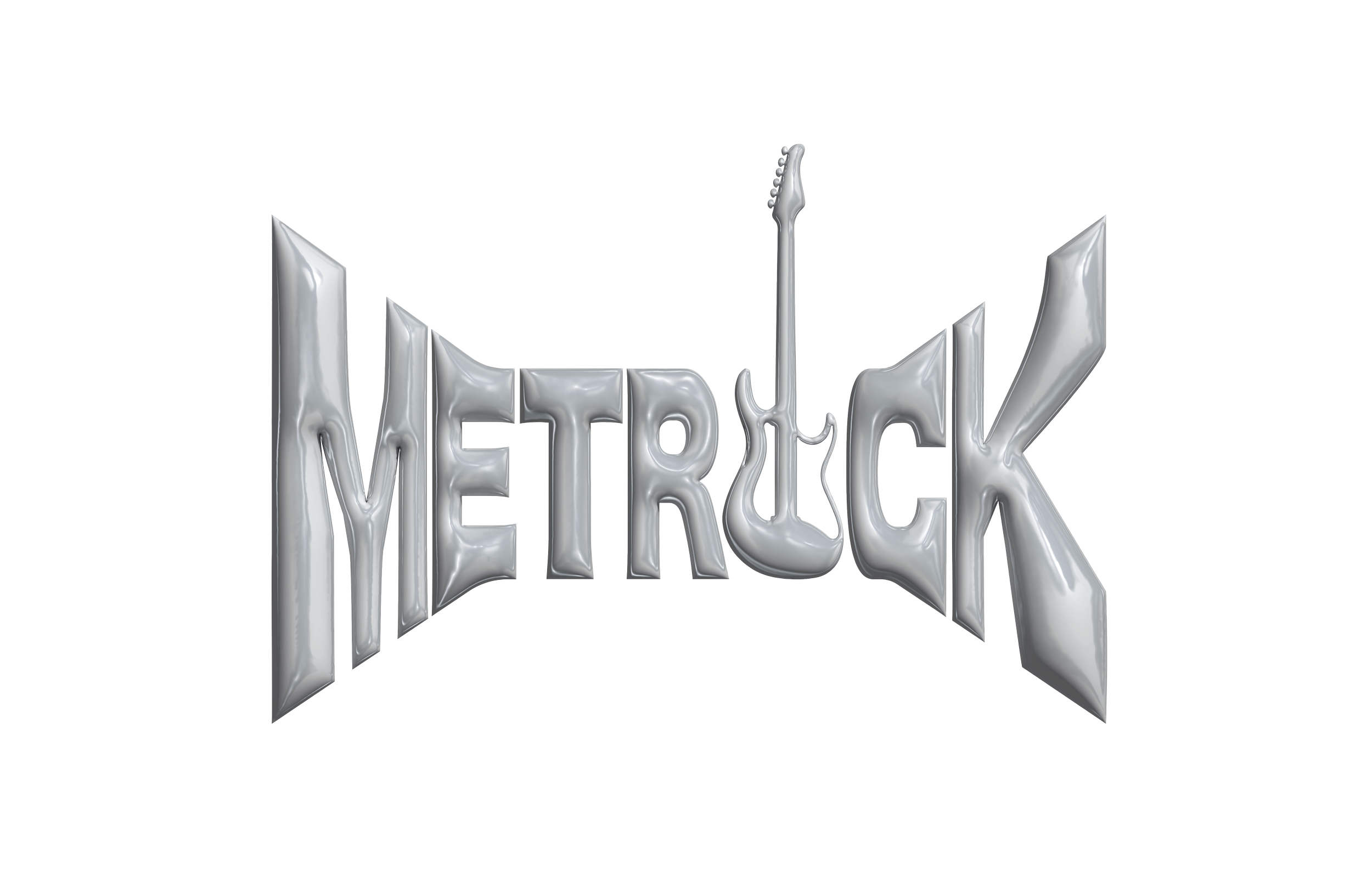
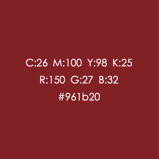
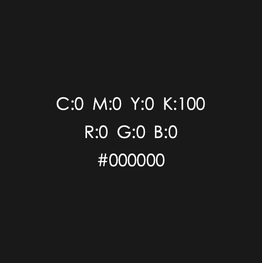
The Metrock Festival color palette draws inspiration from the edgy feel of metallic rock, combined with timeless fashion trends. The primary colors are featured in the logo, while the secondary palette is used for imagery and other branding assets to create a cohesive identity.
Typeface: Hiragino Sans
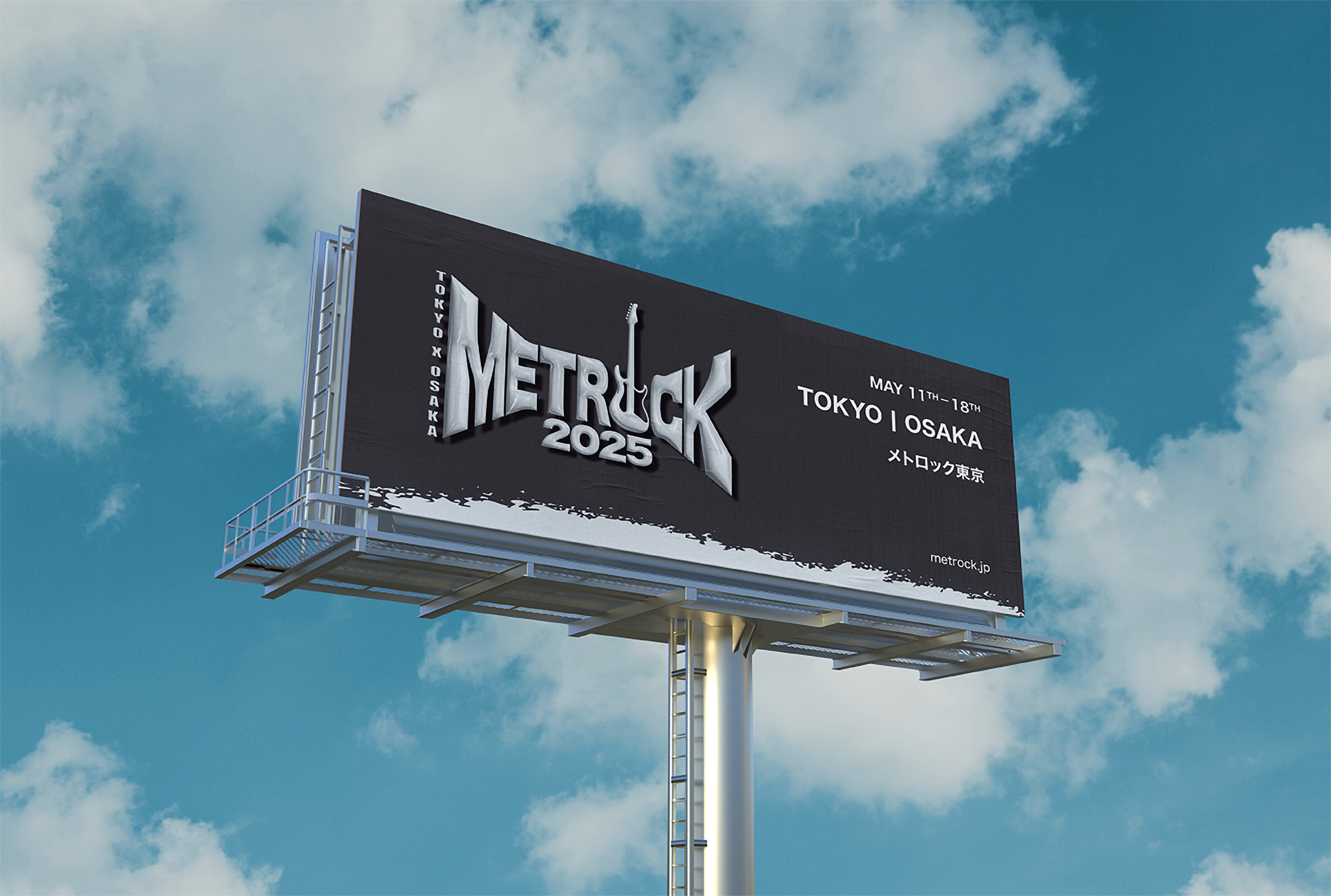
The identity uses Hiragino Sans, a modern Japanese typeface known for its balanced geometry and strong legibility. Its squared proportions and restrained curves create a visual rhythm that complements the bold energy of a rock festival while maintaining clarity across large-scale applications such as posters and billboards.
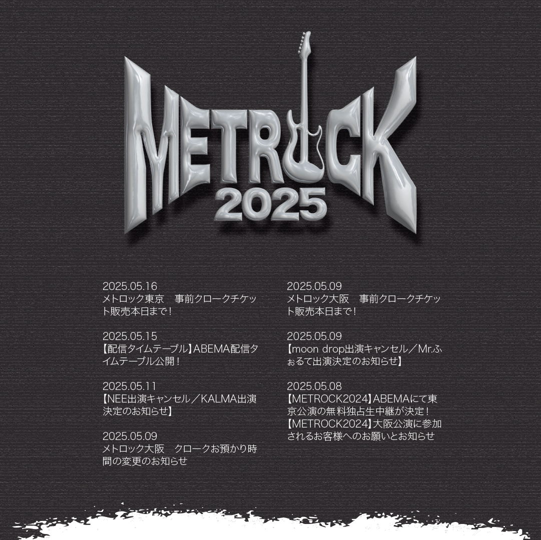
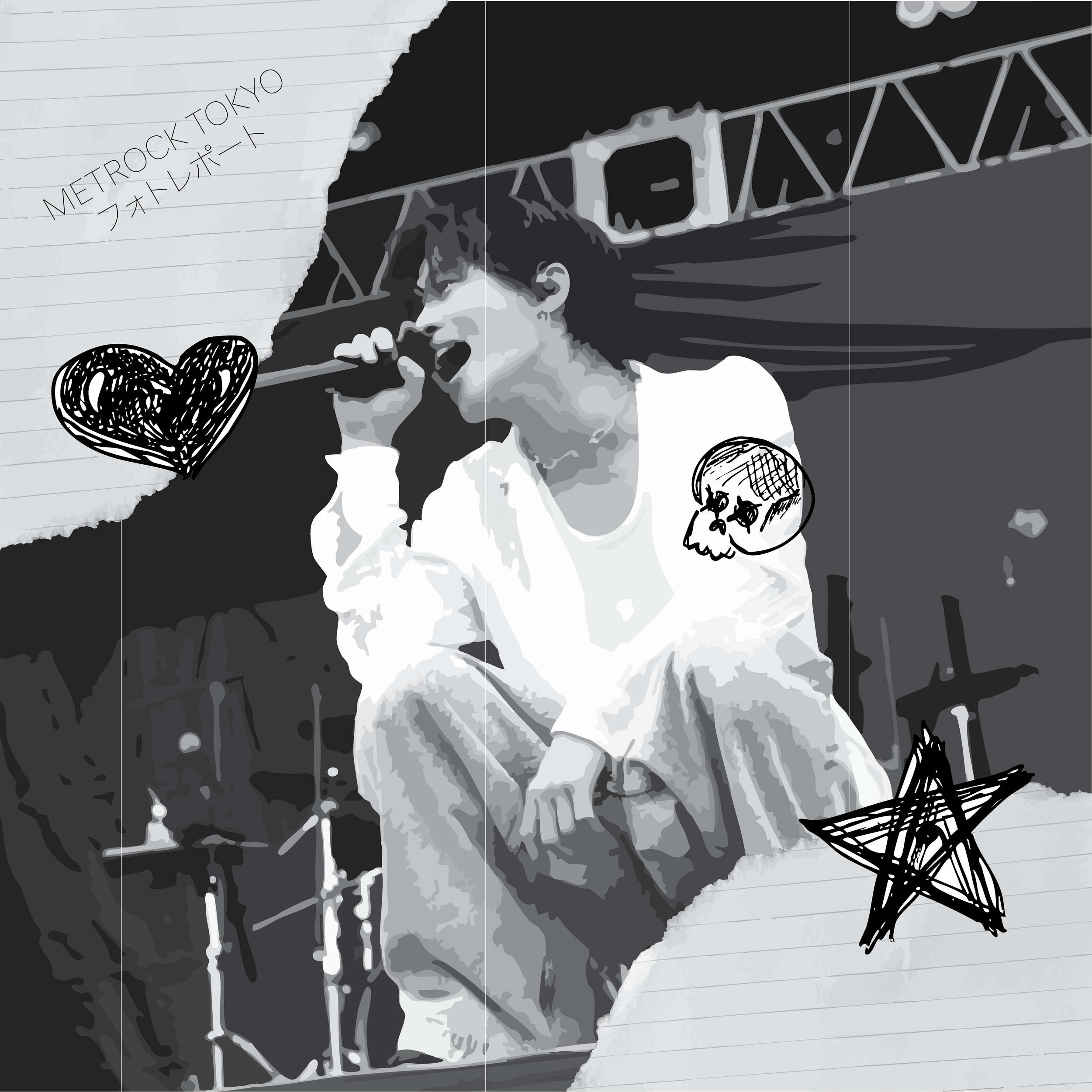
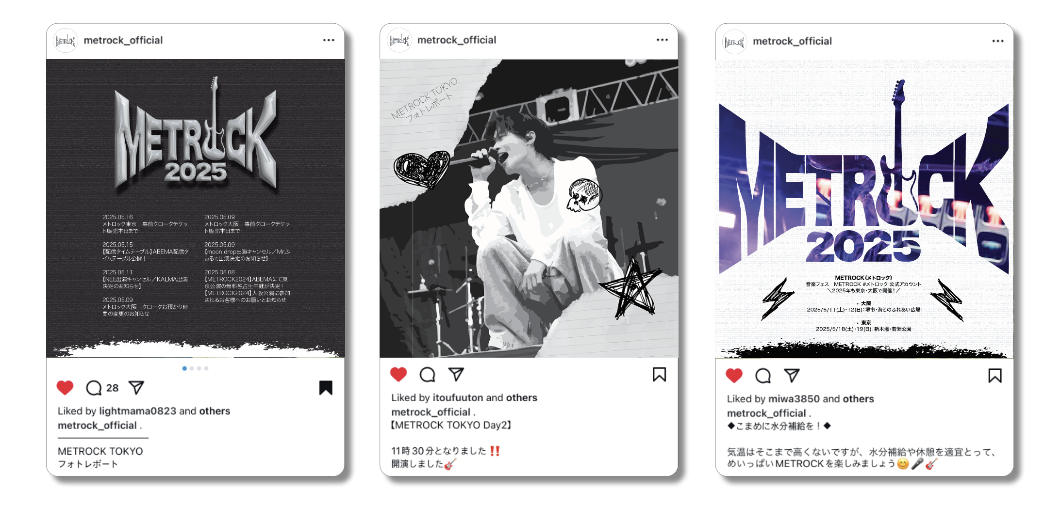
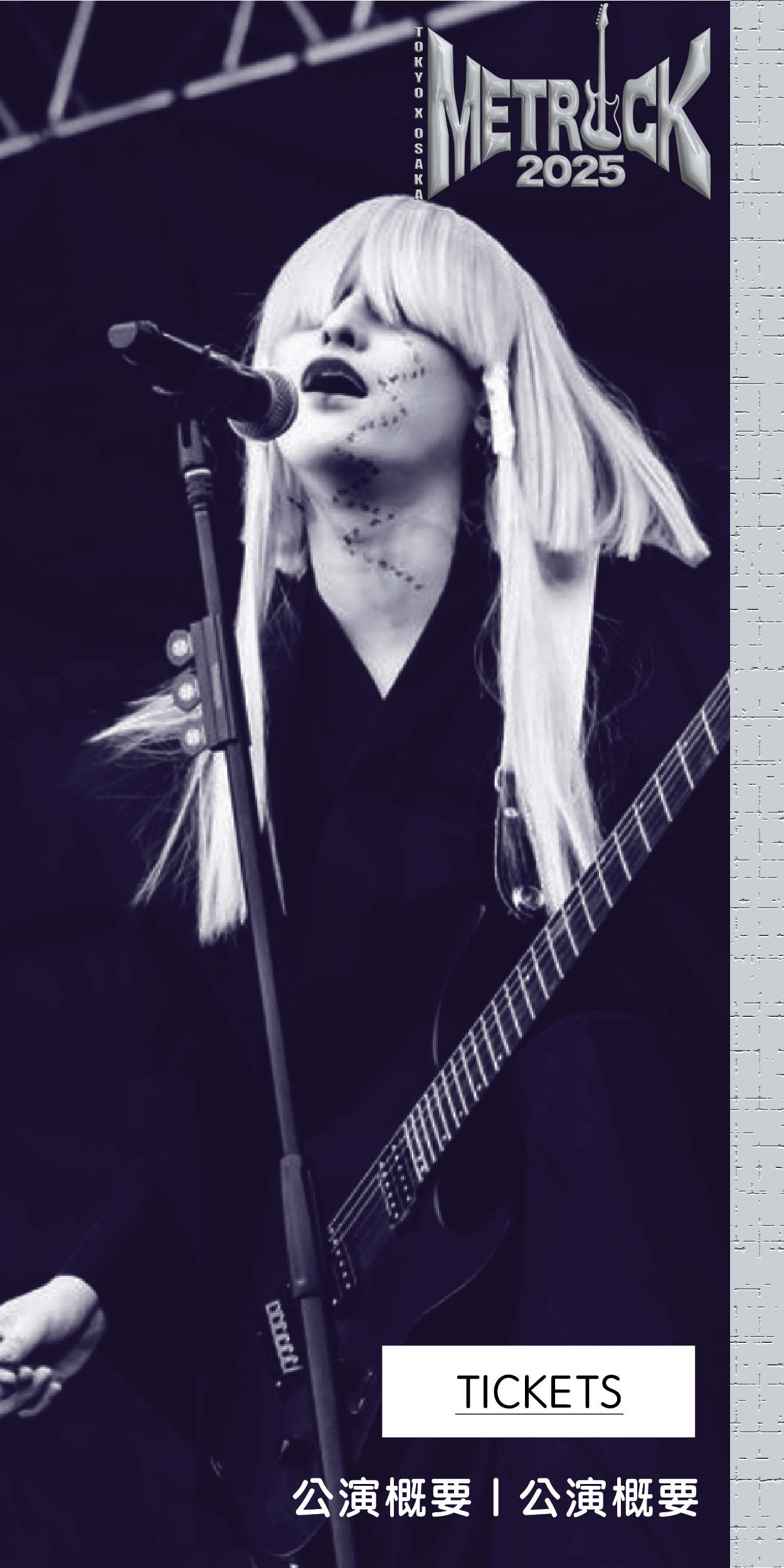
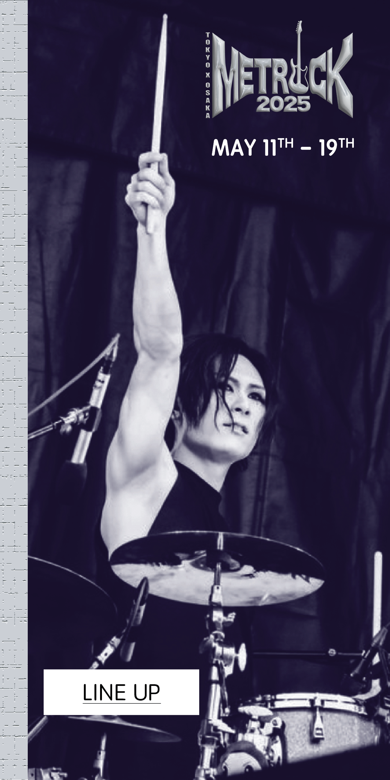
SOCIAL MEDIA Graphics
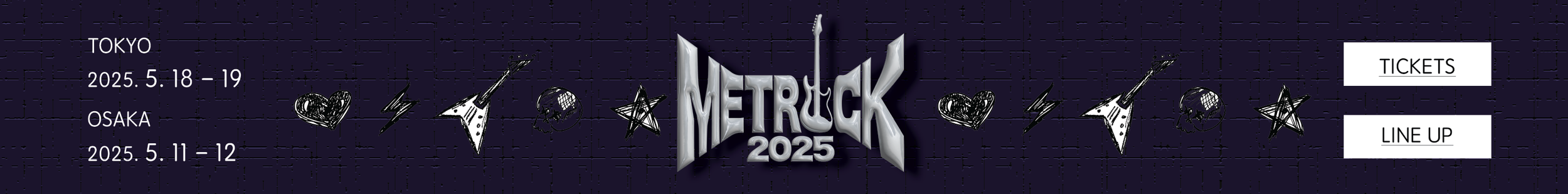
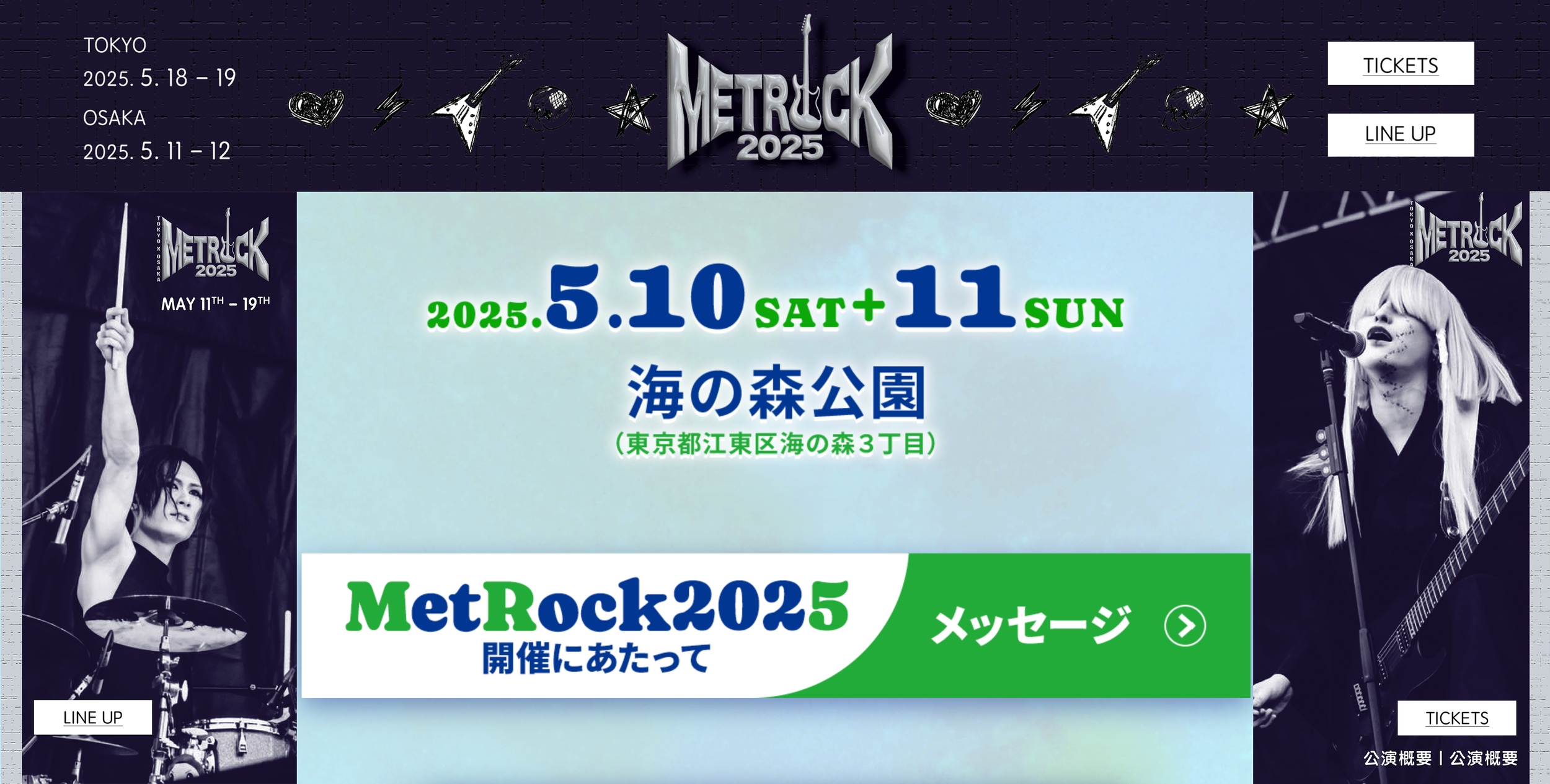
web banner
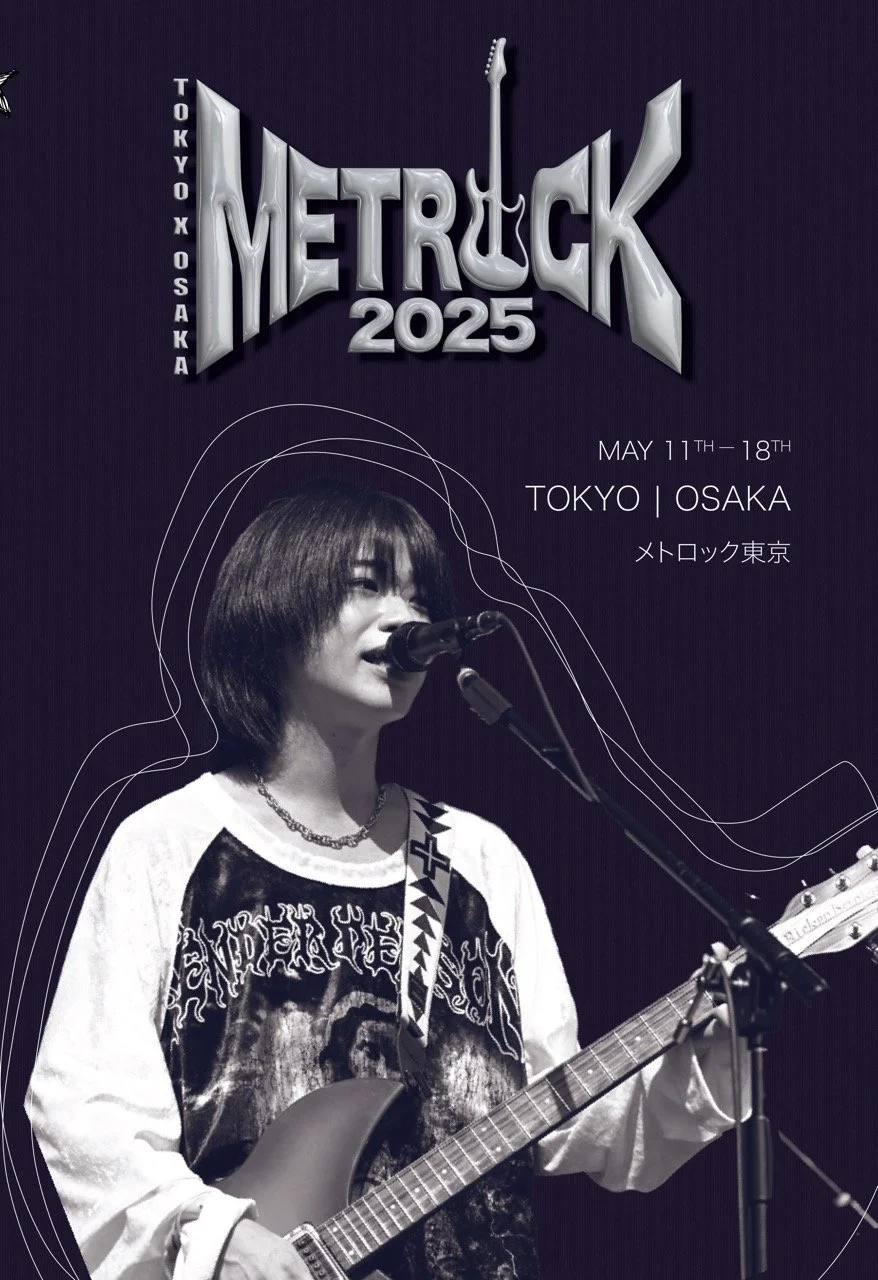
poster
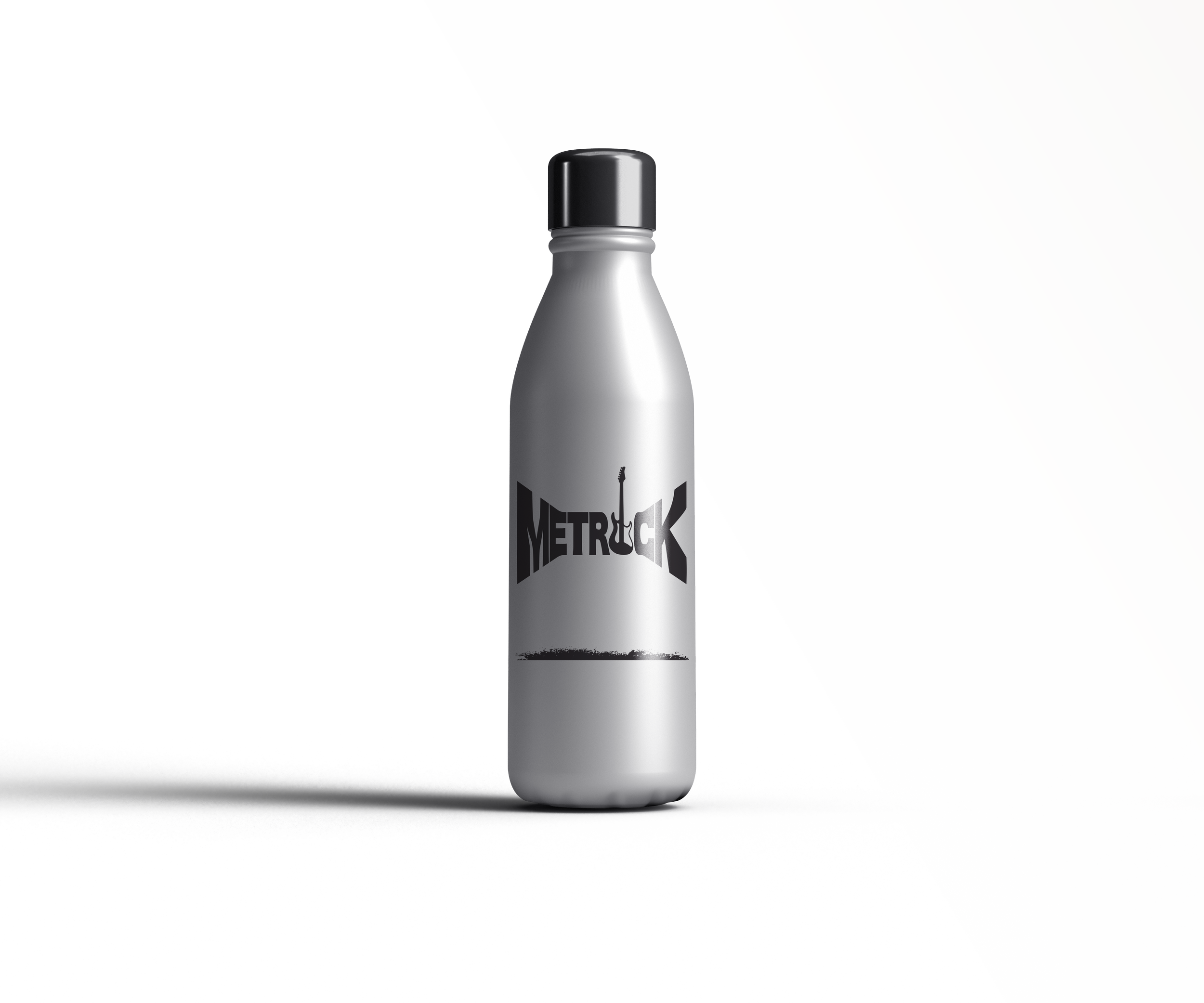
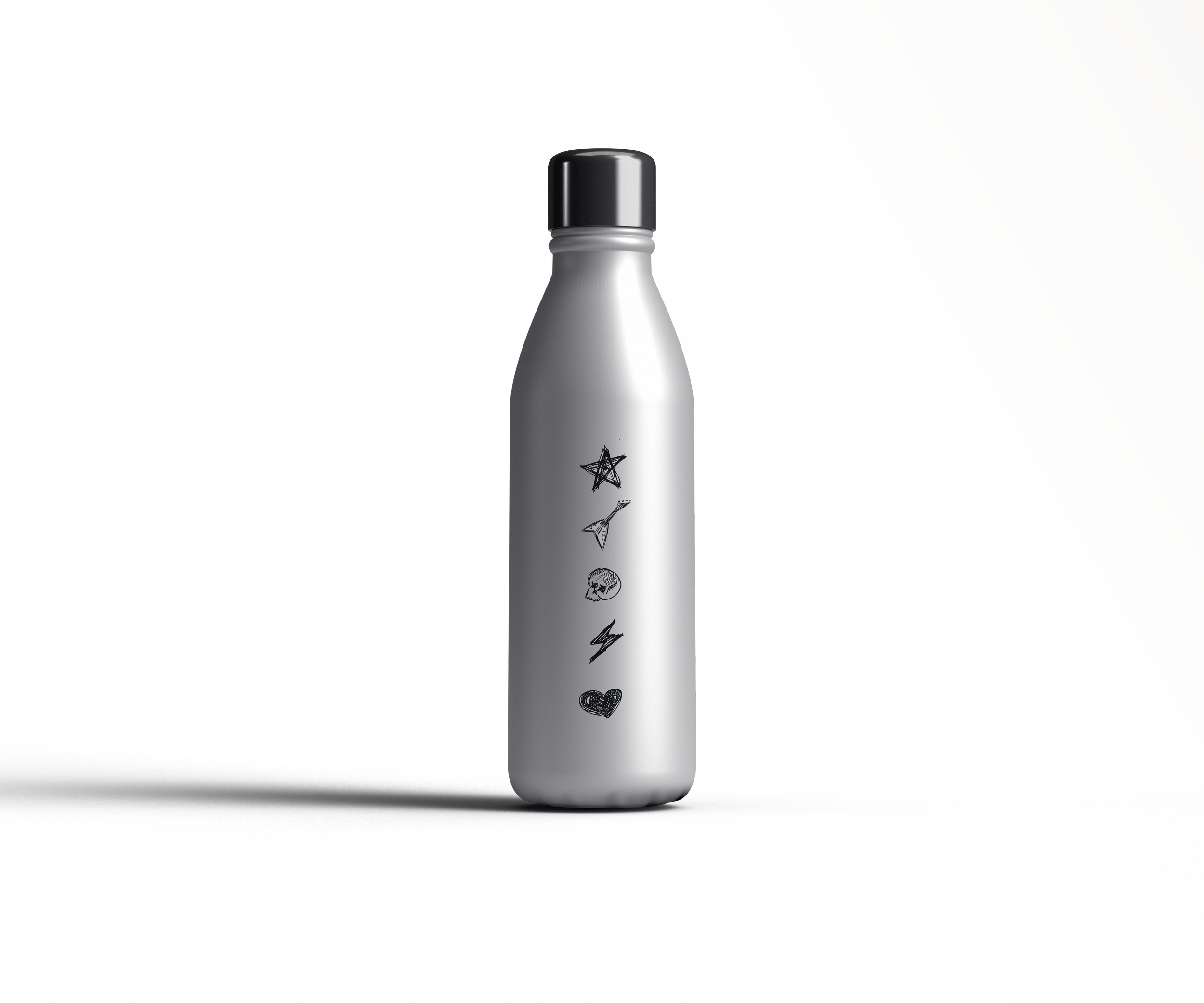
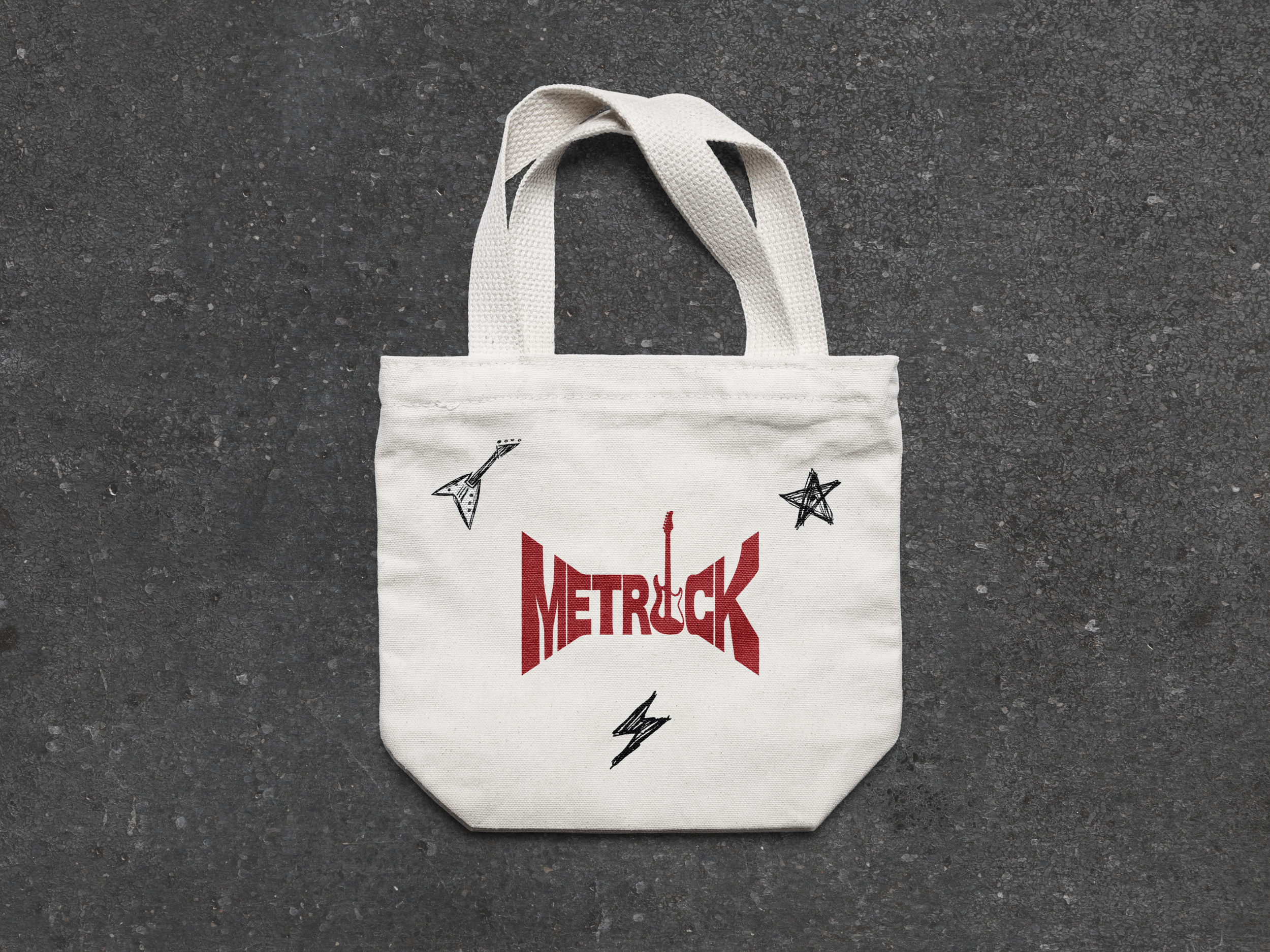
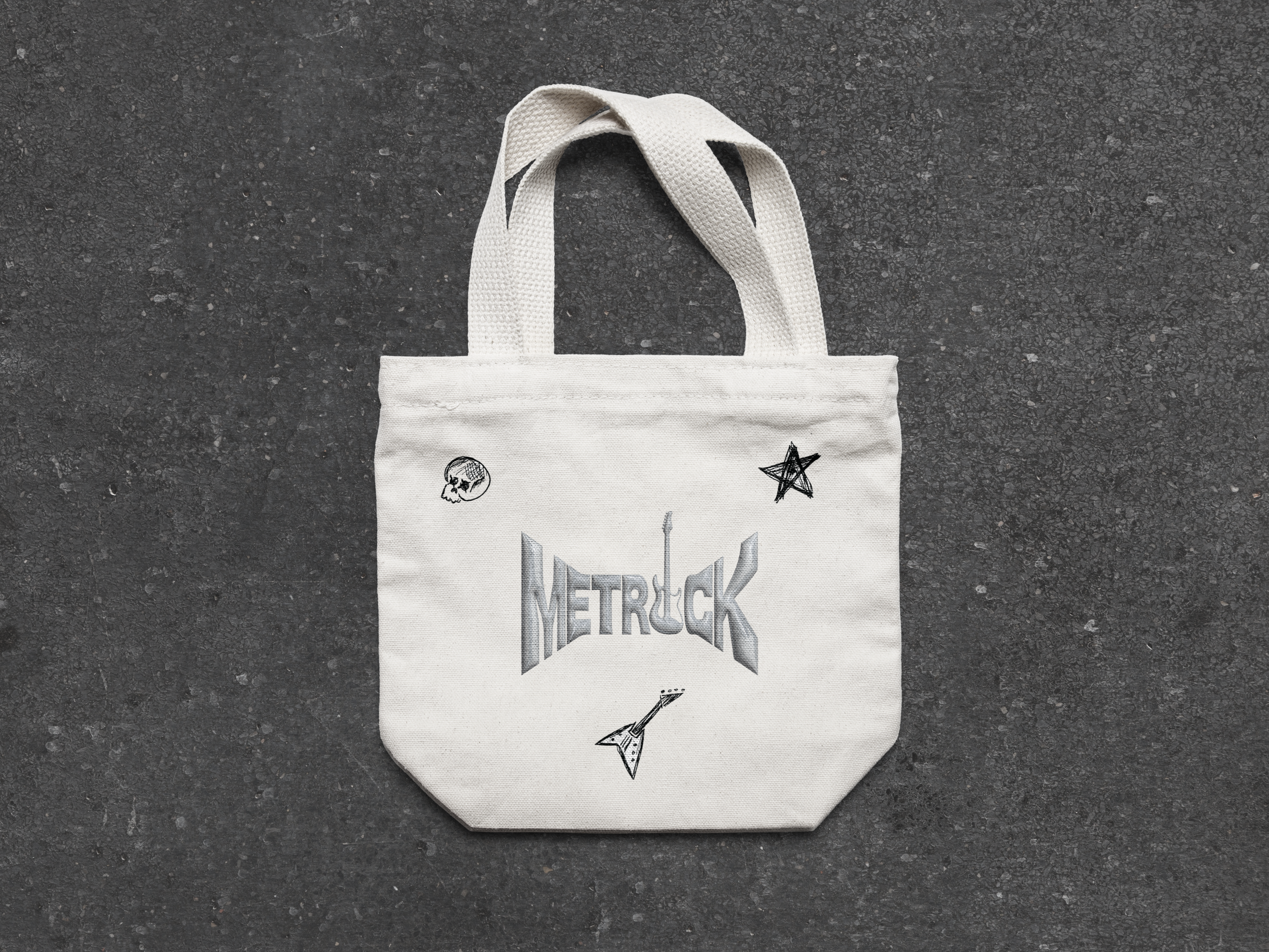
merchandise
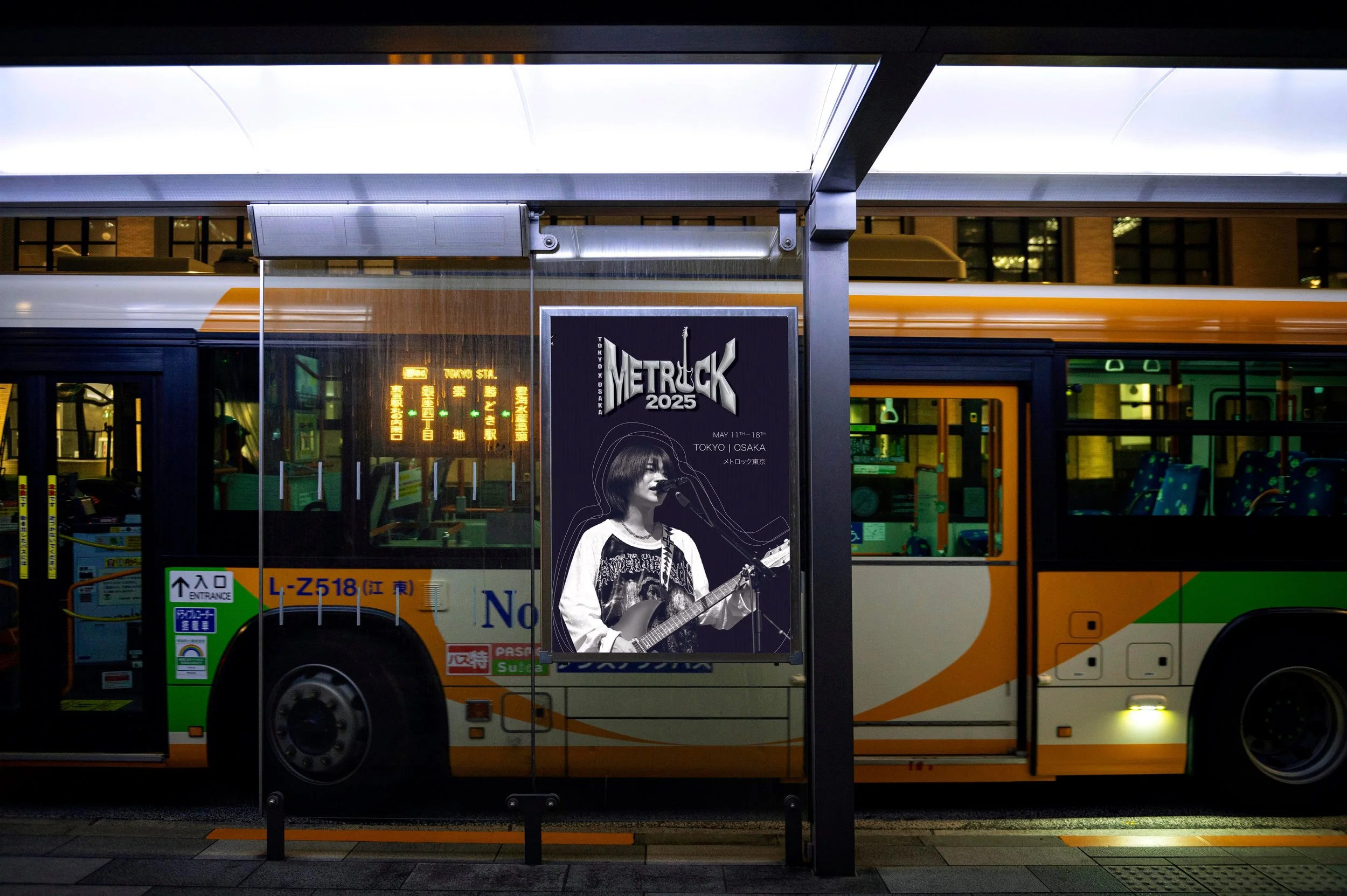
billboard
This project was created for educational purposes. Some visual assets may be sourced from publicly available materials and are used for non-commercial presentation.